Getting bold with packaging design for Shicken
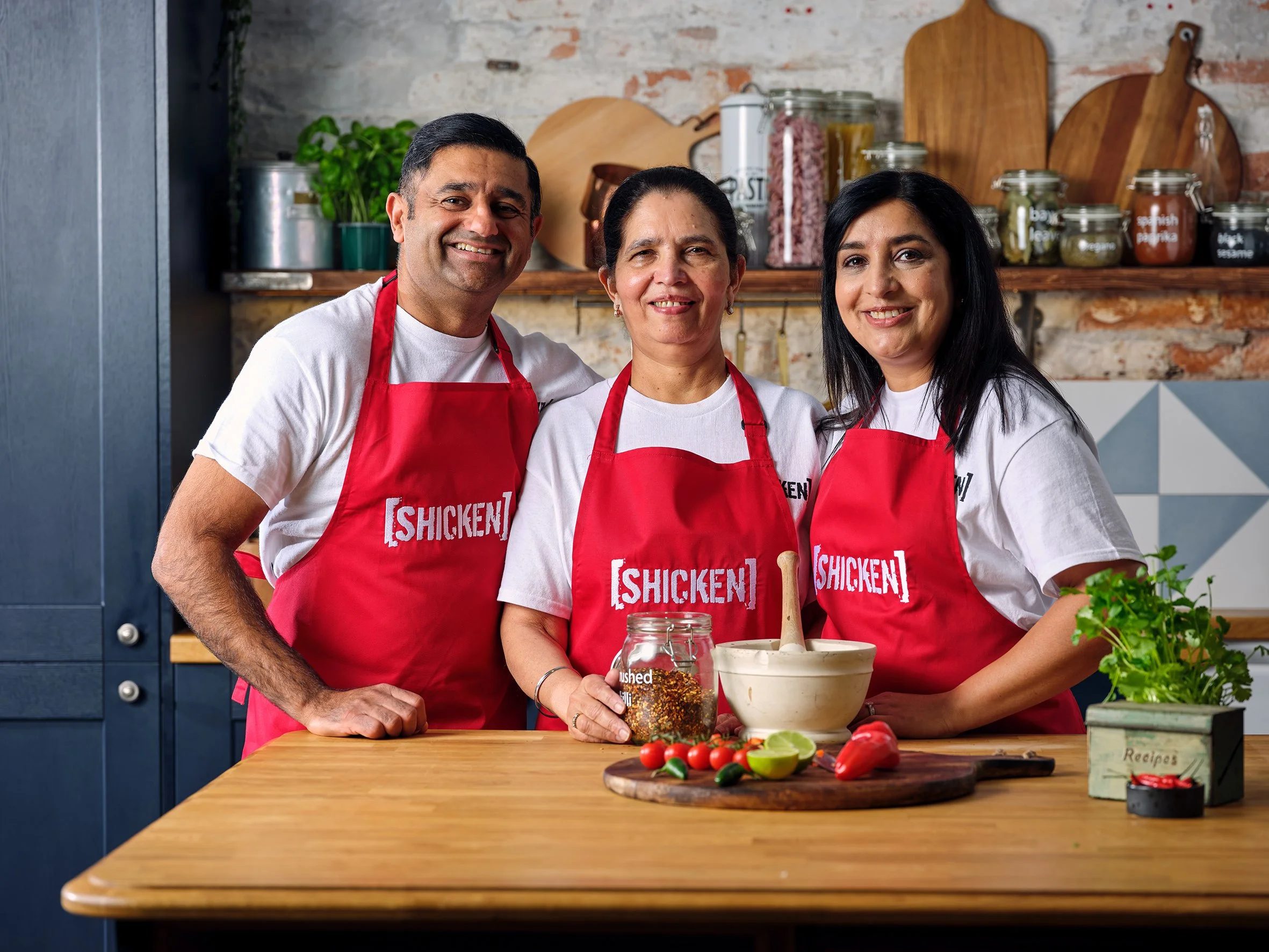
Shicken create plant-based ‘restaurant worthy’ Indian ready meals available online and through retailers including Tesco and Costco. What began as a family business created during lockdown became a global ready meal supplier within three years — with their products available in the USA, Middle East, Sweden, Spain, Iceland and France.
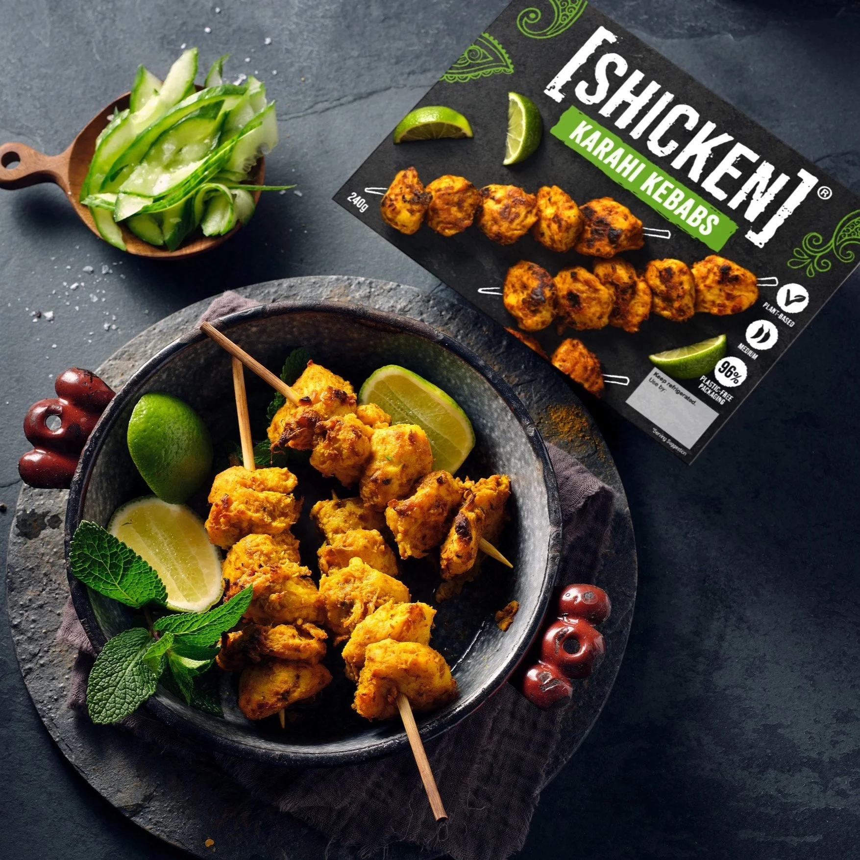
We partnered with their team to create a fresh packaging design that would capture their bold vision and flavours. Following market research, trends and consumer analysis — while working closely with the client — we developed a striking but simple design centred on a ‘hunger-inducing’ image of the dish.
We refined Shicken’s logo so that it was more readable and contemporary — and moved it front-and-centre of the packaging so it would stand out on the shelf. And also reflects the boldness of the brand. The addition of a black slate background created a beautiful texture and premium feel. While utilising visual elements, including illustrated hand drawn henna, connected the product to their family heritage and brand story.
Brand Strategy
Tone Of Voice
Packaging Design
Illustration
Photography
Brand Strategy Tone Of Voice Packaging Design Illustration Photography


Client: Shicken
Creative Direction: Katrina Tolley
Design & Artwork: James Fox
Copy & Tone Of Voice: Jennifer Lee O'Brien
Illustration: Andy Carter
Packaging Photography: Grain Studio